
About the project
Another key project at Cancer Research was improving what was revealed to be a confusing donation experience, we conducted user testing sessions and gathered enough feedback to warrant improving this experience.
Problem
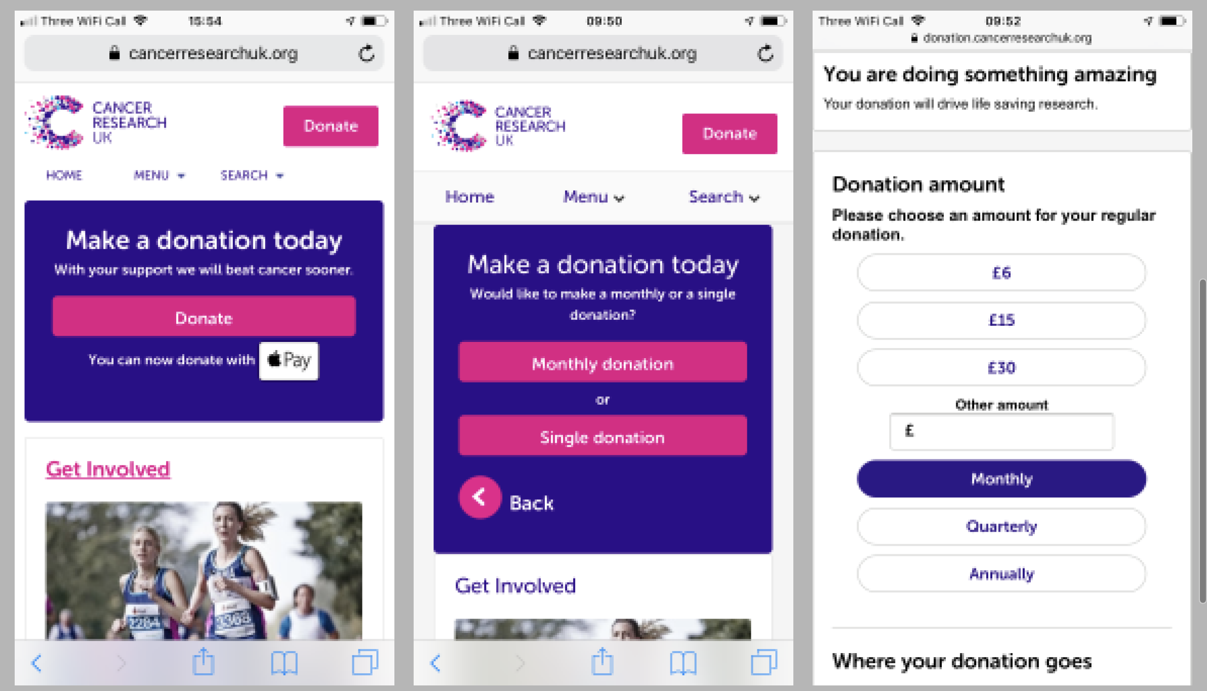
The UI was inconsistent on the donation journey and users reported that they felt like they were no longer on the donation section.
Solution
Create more harmonious UI on the donation journey sections. I worked on prototyping the interface based on the feedback and created an interactive mockup that was re-tested and subsequently used in the A/B testing process.
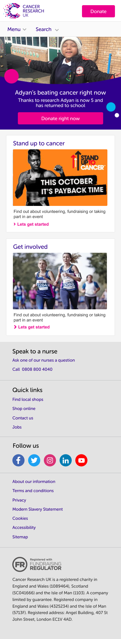
At the same time, I discussed with the Brand Consultant my idea that we should add imagery from the redesign hero area from the desktop. This would connect users to a cause at CRUK.
New version for A/B Testing
For the new UI design and the journey, I created a consistent page layout in a card style area, meaning that the interactive space was in the same area. On the third screen, the background is now matching the first two journey screens and also the CTA is disabled until the user has selected a donation amount. The back CTA is slightly more discreet to discourage backwards movement.
Initial Donation Screen 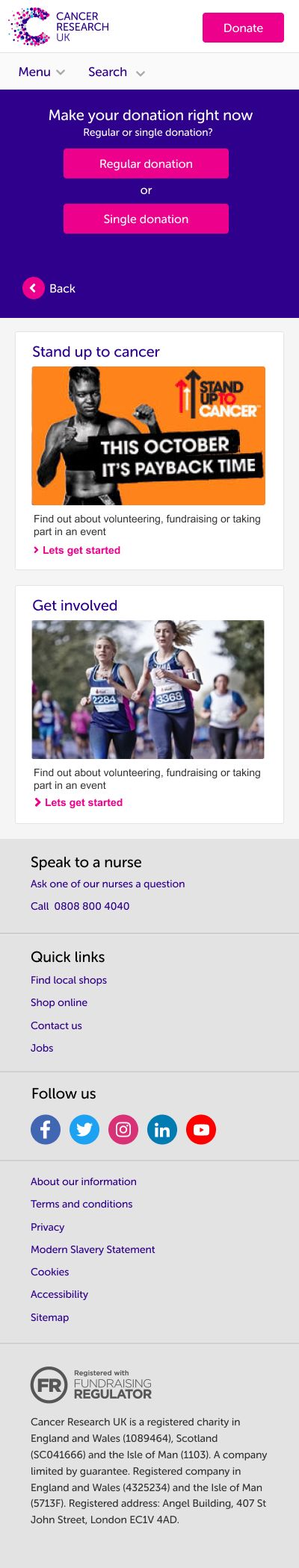
Choose Frequency 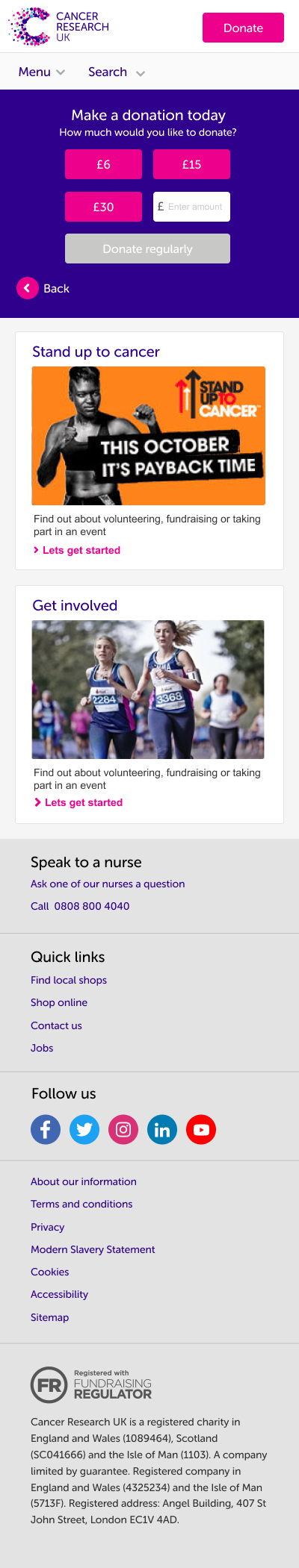
Choose Amount
Result
We retested this prototype with 5 users, who reported no confusion. By adding consistent UI and adding imagery to this section to allow a marketing push we had an uptake in donations from this screen.