Learn Bonds Project
Ongoing project for a financial comparison site along the lines of money supermarket. Providing expert money advice, product reviews and courses.
This product is using Finsys Design System to power components. I created a full set of colours and fonts to override the styles of the Design Systems base styles using overrides on Sketch. I worked on the initial branding, defining palette and creating a logo.
All stages of design from responsive wireframes through to high fidelity UI design and customised icons, creating prototypes to describe to stakeholder and developers how journeys work. For UI animation I used Sketch Anima plugin from which I exported transitional code and video capture for developer handover.
Product Process
- Define problem statement
- Stakeholder interviews
- Roadmap
- UX and brand design research
- Brand design and guidelines
- Wireframes and Hi-Fidelity design
- UI animation
- Developer handover
- Design QA
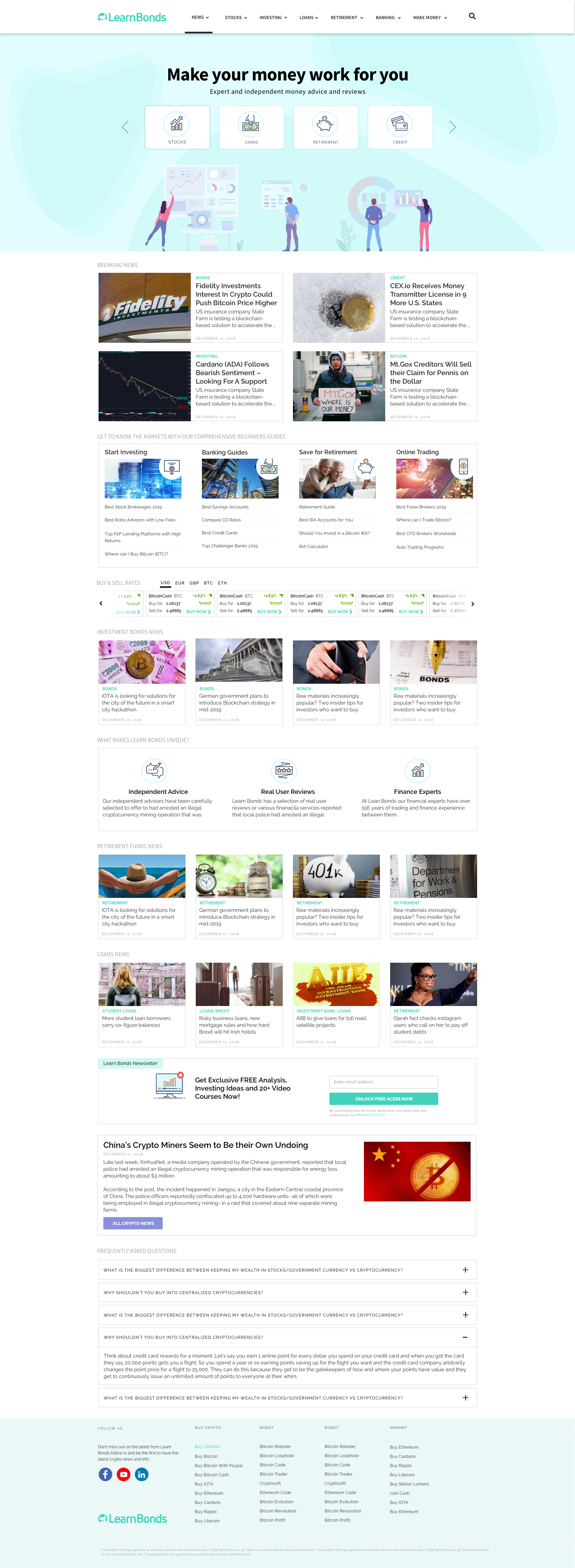
Learn Bonds Home Screen
The home screen is based around a news hub and has editor driven content. This leads on to news articles and news hub sections. Taking influence from major online publishers I have created three types of news cards which can be used to show importance.
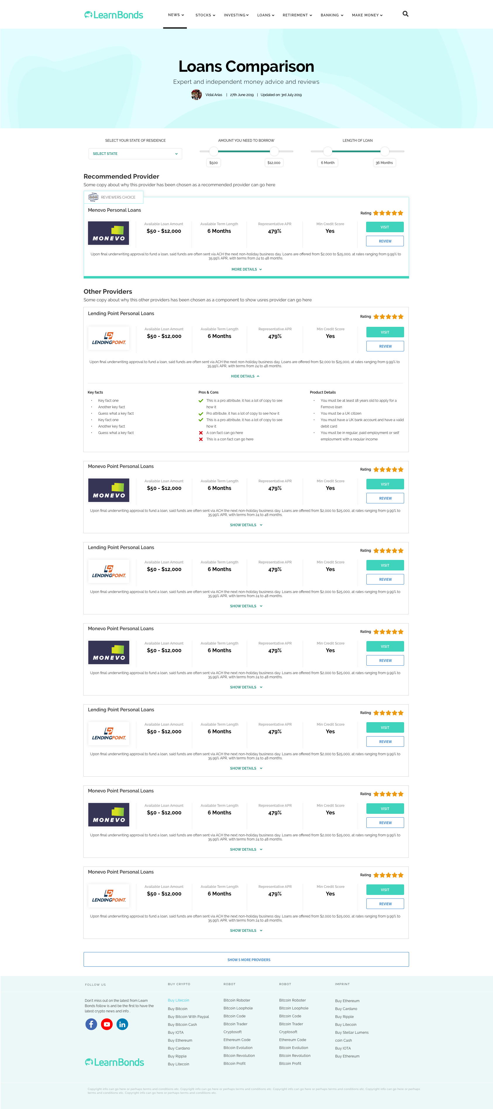
Loans Comparison Screen
The loans comparison screen helps users to choose and filter loan types and amounts of borrowing. Slider bars add functionality and playfulness to the screen. A dropdown was added for use in the USA in which states have different lending rules.
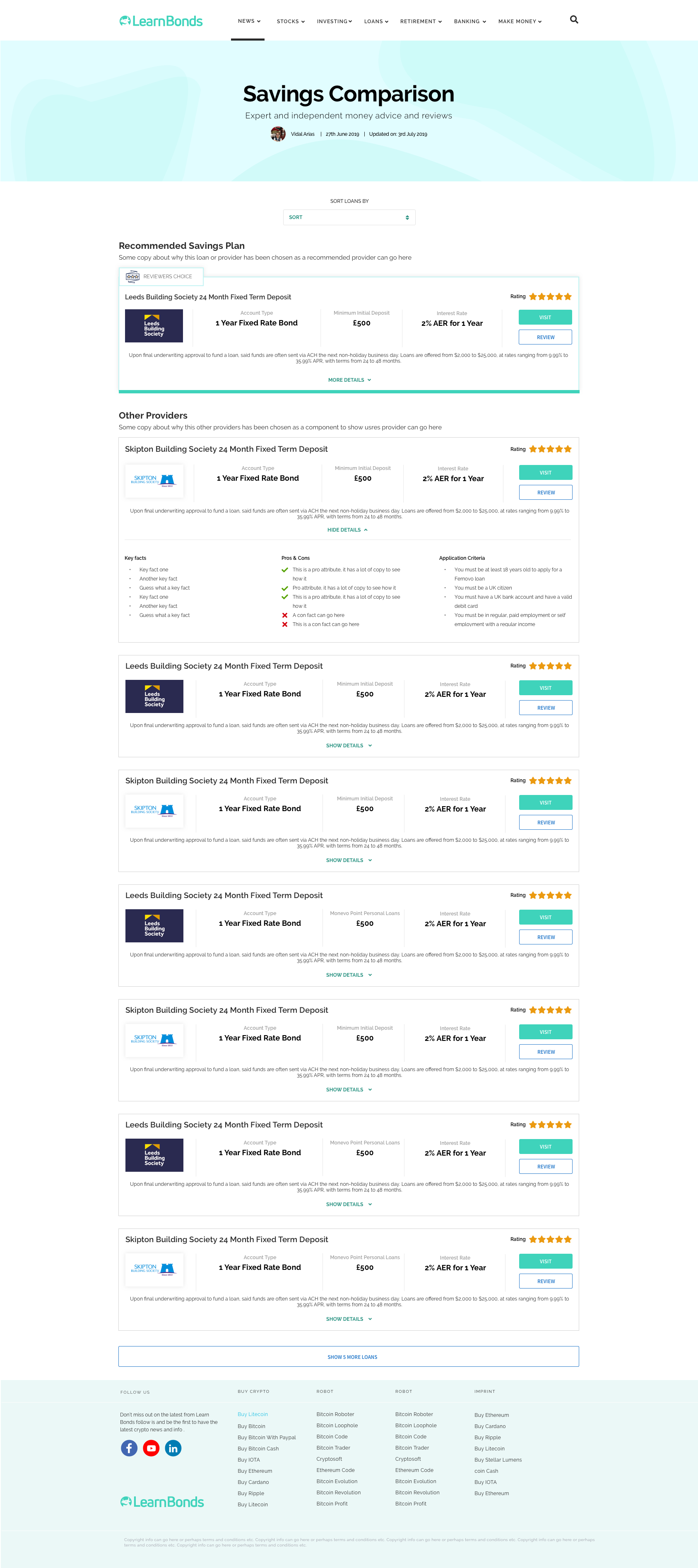
Savings Comparison Screen
The savings comparison screen helps users to choose and filter savings types. A dropdown was added to enables filtering if types of loans. The first card design is highlighted as Recommended to enable the business to push high-value partners. On each card design is an expert view with more detailed product information.