Coutts App Investments
As part of the digital transformation projects at Coutts Private Bank, I was tasked with leading the UI design for the investments sections of both the iOS and Android Apps and responsive website. Two Coutts design systems power the investments sections.
Natwest group put an investments team together to manage the project, consisting of a project manager, product owner, business analyst, UX designer, developers, strategy manager and UI designer. We had daily stand-ups, weekly project meetings, product review meetings to provide feedback to iterate designs and retros.
I worked closely with the UX designer to conceptualise the flows and product design; I then created high fidelity designs and interactive prototypes to test with users to gain qualitative data and iterate designs.
Sample of investments screens below

Investments features
- The main hub screen with an overview of accounts and account features.
- List of investment accounts and types with a performance indicator for each.
- Account overview, filter investments by asset allocation, geography, currency and sector. A chart to easily view proportional representations of each asset.
- Account details section.
- Transactions view for each investment account, with search facility and order by month.
- Documents download area.
- Actions tray.
- Bespoke icons for geography.
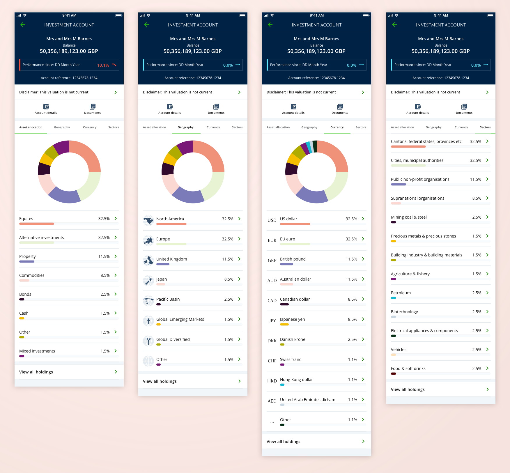
Performance and assets by allocation
For each investment account the user can filter investments by asset allocation, geography, currency and sector. Donut chart represent asset allocation, geographies and currency, the team decided that for sectors we would only use a list format because there are over 70 possible sectors. The top section has overview details of each account, name, balance, performance since and account reference. All of the components are bespoke and I took them through several rounds of iteration
Below is a selection of core screens examples of performance and asset allocation.
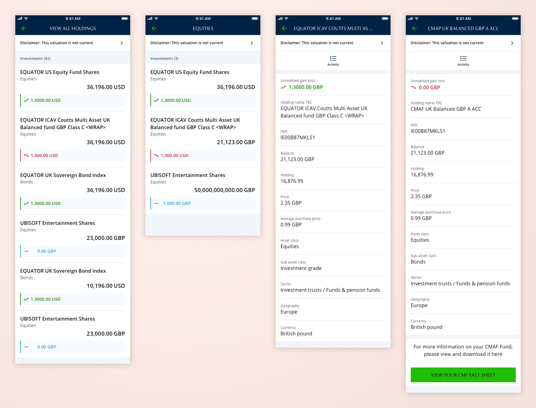
View holdings
For each investment account can be made up of several holding and we need to able to drill-down and show these individually. Included in the initial card design are name of holding, type of holding, amount of holding and performance details. There is then a further details screen with various in depth (expert view) details, from here you can also click through to activity details (transactions).
Below is a selection of core screens examples of view holdings.
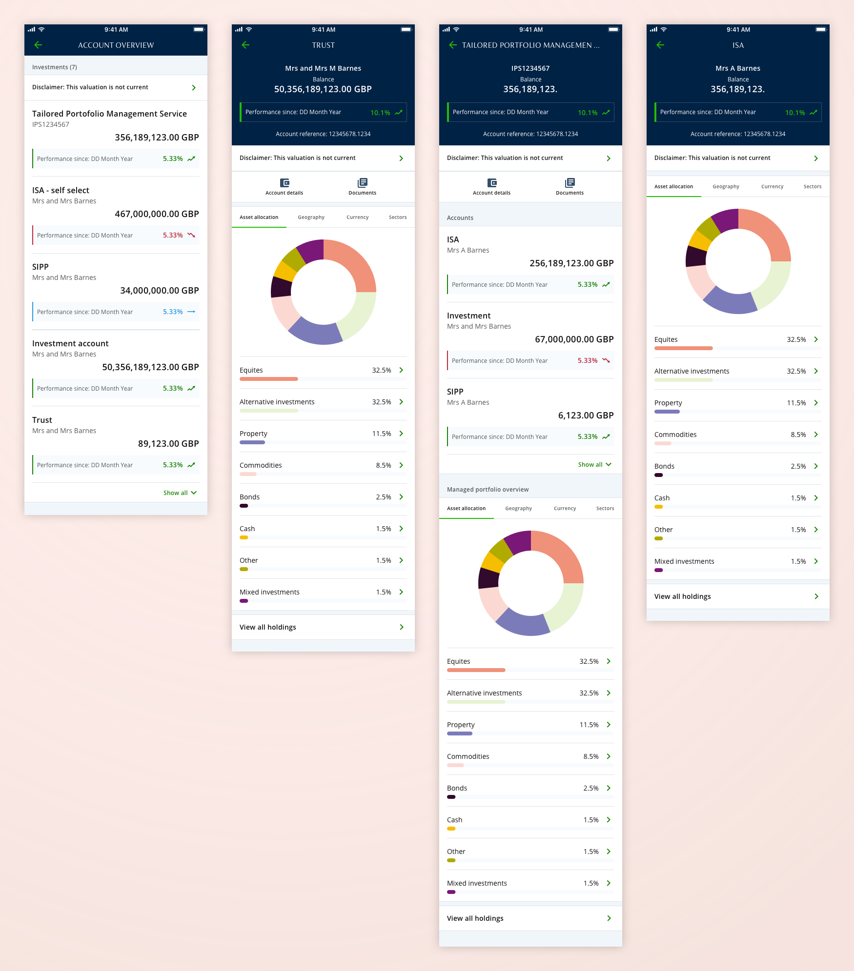
Account types
The are several investments accounts types, such as trust, ISA, SIPP and managed accounts. These are accessed through a list of accounts. The managed account contains multiple investments that are controlled by a portfolio manager, and so required a bespoke solution for users to view their account details. Each account type had various requirements that needed to be designed.
Below is a selection of core screens examples of account list and account types.
Transactions and search
Each investment has a transaction details page with search facility so the user can filter by either name or amount of investment.
Below is a selection of core screens examples of transactions and search.
Bespoke geography icons
I created a set of bespoke set of geography icons for the filter investment assets.
Below are the geography icons.