
Introduction
For the new digital transformation project, the Coutts Private Bank put together a team for the new and improved banking app for iOS, Android and Web. Since the original app launch ten year beforehand, there had been considerable advances in technology and web standards.
We had an opportunity to create significant improvements by adding biometrics identity verification, improved user experience, compliance to accessibility standards, and adding new features such as app-enabled payments and investments tracking and more.
Two designs systems were created and used to power the banking components and user journeys for multiple workstreams. The new design system and user journeys utilise iOS and Android platforms native functionality to improve users transition to Coutts new banking applications. The new Coutts branding was aligned with digital requirements and implemented within the design and final user interfaces.
The expectations were to deliver a vastly improved online and app banking platform that adhered to the new web standard, was accessible and with new features and better journeys.
Abstract set up and workflow
The new designs systems needed adding to Abstract for the whole team to use, libraries setting up, and a duplicate creating and turned in to greyscale for UX designers to mock up wireframes.
As a new team, we created a complete workflow from gathering specifications to designing and handing design specifications over to the development company. After consultations with the app and website developers we decided to use an industry standard hand over tool called Zeplin.
The libraries that were set up to power the design systems:
- Styles: Fonts, colours, icons, logos, charts
- Base components: Common design patterns, buttons, fields, radio buttons, etc
- iOS: Native iOS components and design components for banking journeys
- Android: Native Android components and design components for banking journeys
Below shows the structuring of the design system library files using the Abstract version control platform
Branding, typography, colours and icons
New brand guidelines needed interpreting for digital applications, including fonts for banking applications, a new UI colour set, icons suitable for digital use, accessibility. After researching best practice for banking applications, I changed the serif font to a san serif to make it easy to scan financial data quickly.
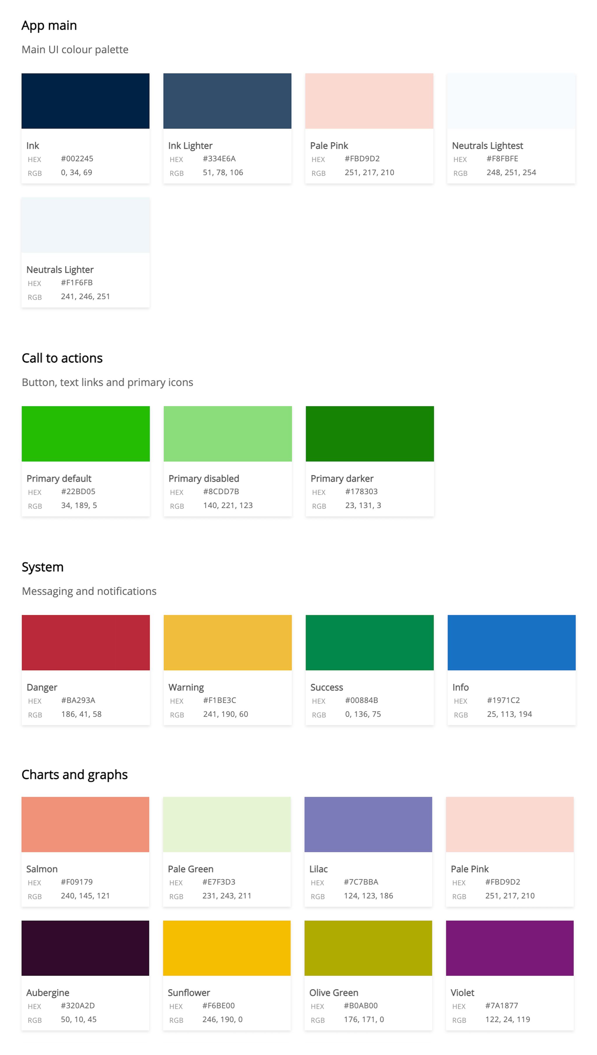
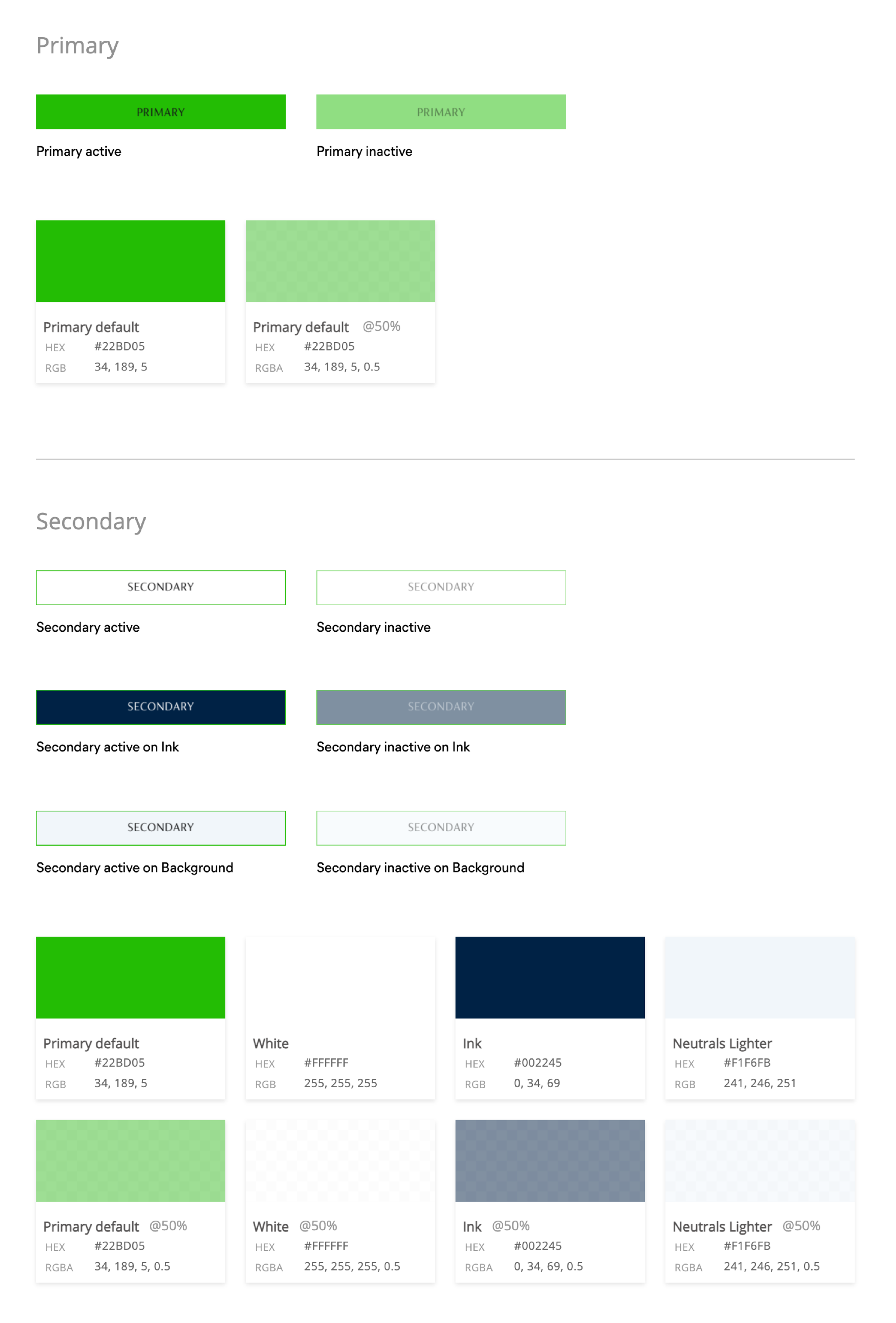
Colour palettes
The colour palettes consist of main UI colour palette, which I used as a base for other contrasting colours to sit over, such as primary action colours, system colours and charts and graphs colours. The main UI palette has no mid tones which helps to keep a high contrast with action colours. I tested UI colours for accessibility and in various situations.
App colour palettes below
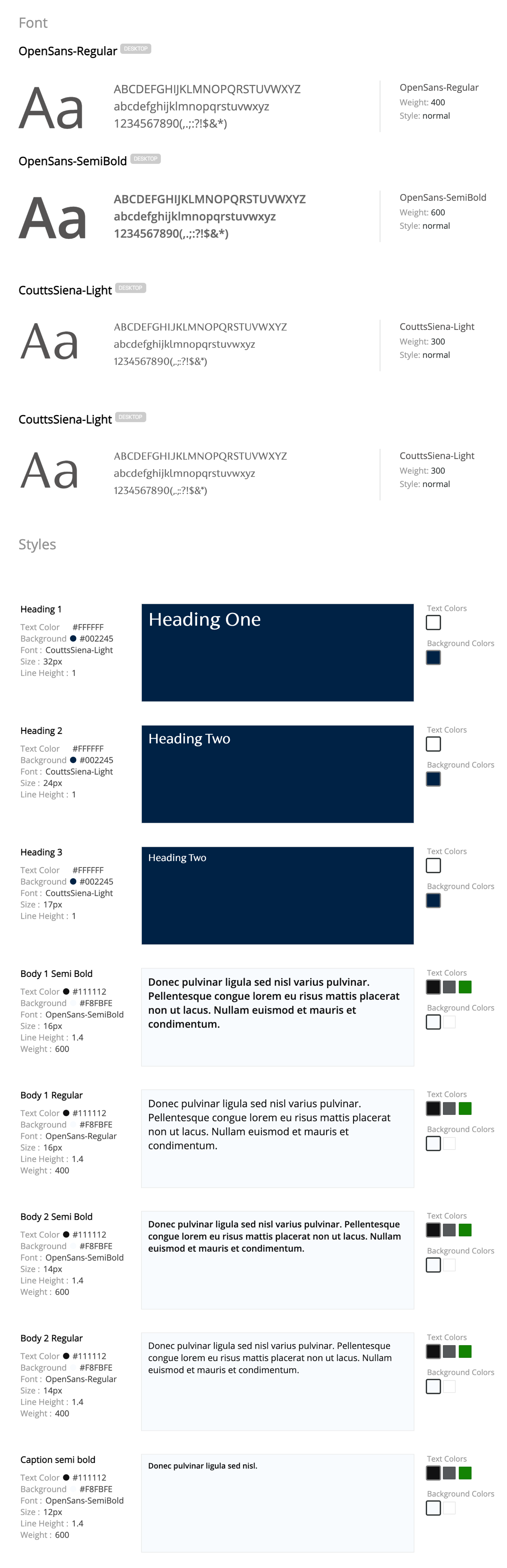
Fonts
Coutts main brand fonts are FS Brabo and Coutts Siena, after researching best practice for banking applications, I changed FS Brabo which is a decorative font to Open Sans to make it easy to scan financial data quickly. For the banking application we used Coutts Siena for a headline font and Open Sans for body font, data.
Small selection of font styles used below:
Icons
I designed a set of icons for use throughout the app, some were specific for iOS and Android use. All of the interactive icons use the brand green to keep consistency throughout the app.
Below is a small selection of the icons
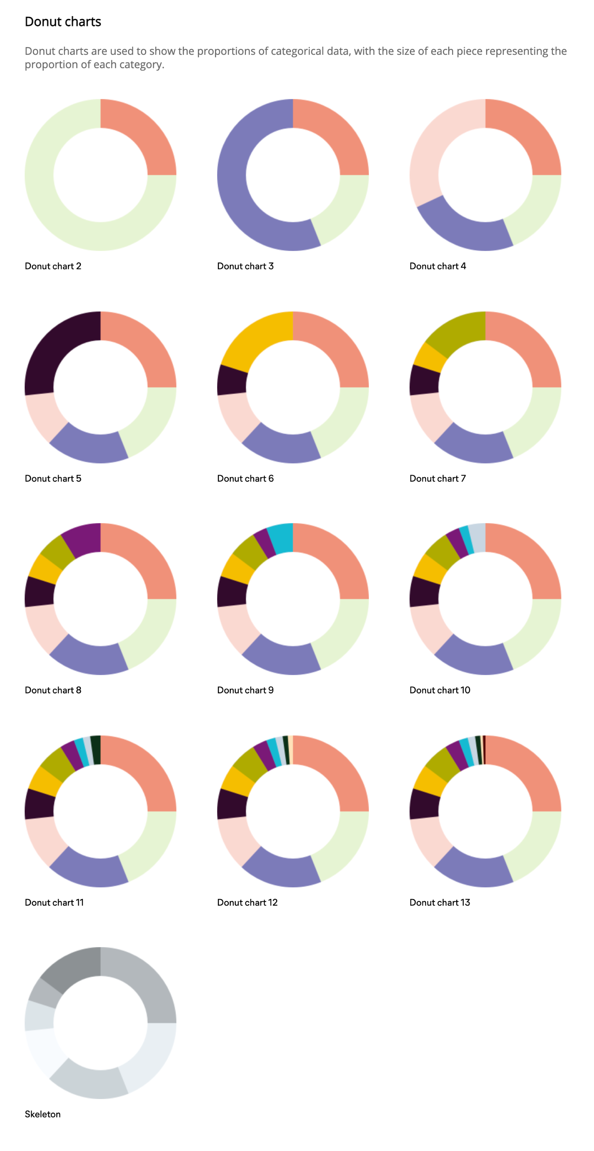
Donut charts
I designed a set of donut charts for the investments journeys of the app. Each section has a colour to represent proportional amounts of investments
Below is the set of donut charts used for investments
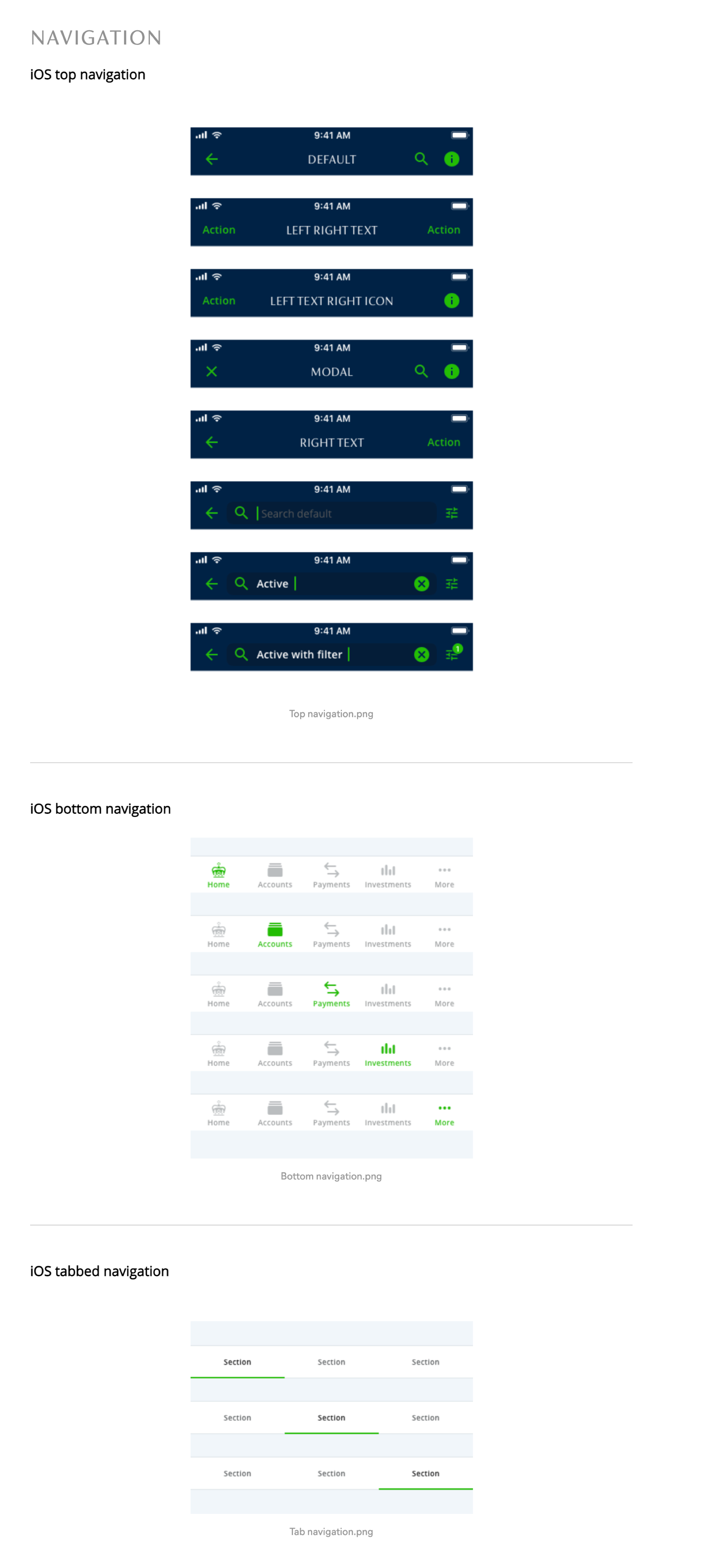
Navigation
I designed a number of different navigation solutions, header navigation, footer navigation, tabbed navigation, list navigation and more.
Below is a selection of the navigation components
Buttons and controls
I designed a set of primary using the brand green to keep a consistent action colour and secondary buttons with a more subtle outline style design.
Below are the basic primary and secondary buttons
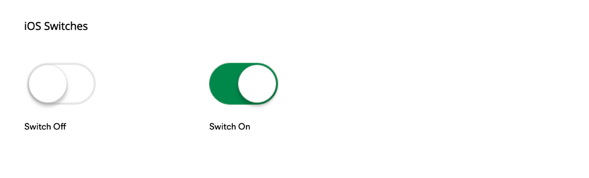
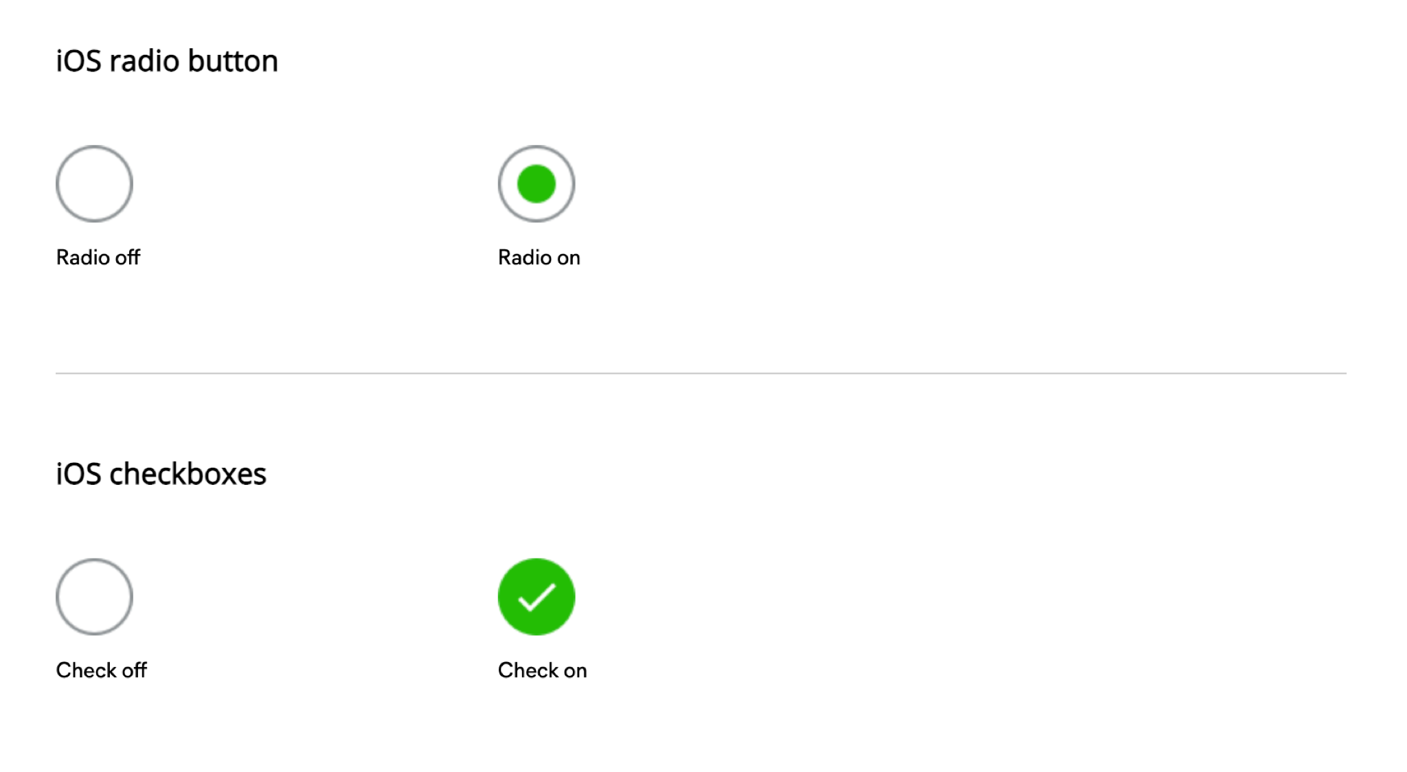
I used iOS and Android style switches and radio buttons.
Below is the iOS style switches and radio buttons
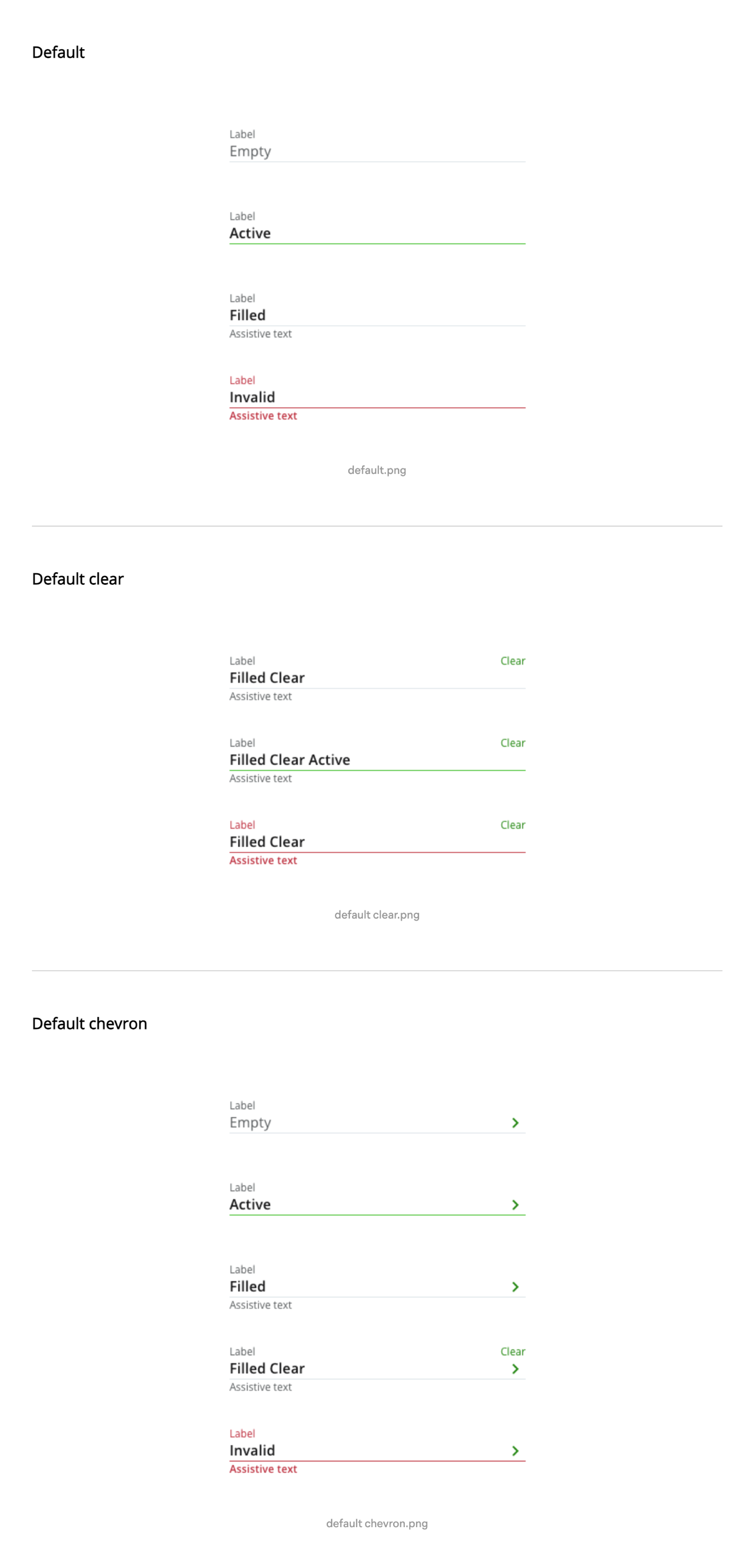
Fields
I designed a set of fields to incorporate, label, input text, assistive/helper text, icons, currency text.
Below is a selection of the fields