
Introduction
During the last few years, I have worked on many design systems, one codenamed “Finsys” in the sector of cryptocurrency and finance and the others were for online gaming frameworks. Several more at Coutts / Natwest Bank for both mobile apps and responsive websites for banking.
Although these were very different sectors the process remained the same.
Components and templates from the gaming design systems contained complex transactional user journeys that required designing into re-useable components and templates.
I’ll walk through the steps of conceiving, designing and implementing a design system with key examples from my previous projects.
A design system is a set of reusable components that are shared with designers in our Sketch UI design application and added to source code library with full documentation.
The re-usable library of components is accompanied by sets of rules and guidelines for designers and developers to use alike. A design system can be part of a wider set of digital foundations that also include brand values, brand look, typography, colour, tone of voice, accessibility and even sustainability and so on.
What’s in a Design System
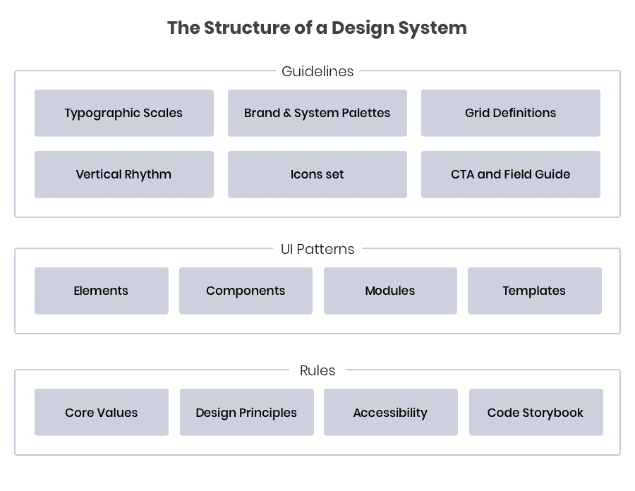
Based on atomic design principles we split up into the following:
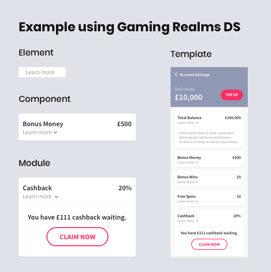
Elements
These are the smallest parts of the design system, a good example would be to refer to a button which is made up of a background and a label, both of which can have various states. An element of a button is its label for example.
Components
Components are UI elements that are used repeatedly throughout a product, often actionable, sometimes to convey meaning. A few examples include buttons, inputs, selects, toggles, avatars and tooltips. Components can include elements, for example, a button component contains elements of input and background shape.
Modules
Modules refer to recurring practices throughout a product. Examples include navigation, cards, tables, empty or loading states, notifications, alerts and modals. Modules can contain components, and be paired together to make up a template.
Templates
A template is the culmination of our components and modules, put together to form a meaningful UI. Consistency is important for good user experience, not just in style, but in the way content is presented. Using as few page templates as possible is good practice so the user gets familiar and understands the UI without adding to much cognitive load.
Problem Statement
“Currently, the components of our site are inconsistent, never re-used or shared resulting in an inefficient workflow, longer delivery time“
Overall steps in the process (T.O.C)
- Documenting the roadmap
- Audit of existing product elements
- Research and design exploration
- Setting up sketch
- Style Guides and visual language
- Defining Sketch font and colour styles
- Components and modules
- Documenting and Engineering the design system
Documenting the roadmap
I created a living document of the roadmap, it was essential to map out the steps and chart the progress of the design system evolution. This document was regularly reviewed as the project progressed, to ensure that velocity was maintained and that the brand and design system was in confluence. I shared this document openly with the digital teams ensure that all were up to date with progress and involved at each stage.
Audit of existing product elements
Auditing allowed us to take stock of existing UI elements by creating a sheet of commonly used components from the existing products site, analysing the products main user journeys helped me gather a visual list of elements whether it be buttons styles or gathering more customised components that are personal to the brand.
Research and design exploration
The next step was for me to look at competitors and non-competitors with similar brand values. I researched and experimented by testing styles, fonts and started to envisage the brand in a digital way.
I studied various brands Design Guideline and design systems to get a good understanding of all the stages of the process. Great examples that I came across included AirBNB and Atlassian’s Design System
This exploration was the point where I could share the tests with the wider product team and stakeholders to get buy-in and to enable me to move onto creating the Design System in sketch and abstract.
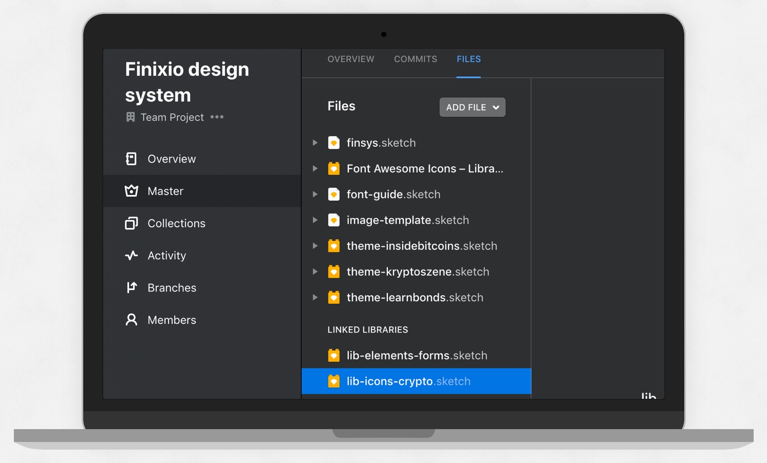
Setting up sketch
When working on something as complex as a design system it’s important to have an environment that makes it easy for multiple designers to work on the project without the risk of overwriting each other’s work. This is where the design ops tool called Abstract comes in.
Abstract works in the same way that developers use git to create branches from a master and have work committed and merged once approved.
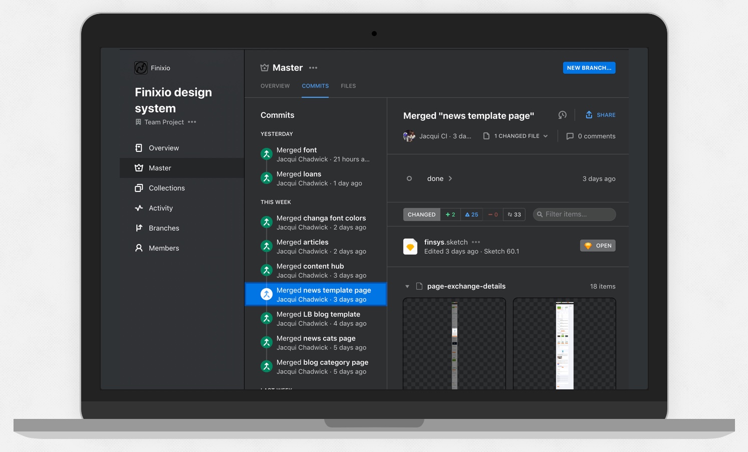
In Sketch App I set up external libraries where designers can quickly construct UI elements and flows using consistent pre-made, editable and flexible Sketch symbols, this enables us to be able to focus on the UX, and not re-designing the same product elements repeatedly.
Essential design system plugins used
- Anima Stacks (Automatically distributes template sections order and spacing when rearranging layout elements)
- Symbol Organiser (distributes and arranges symbol art board)
- Layout Settings (copy and paste layout grids which have been missing from sketch)
- Sketch Measure (Apply measurement annotations)
- Merge Duplicate Symbols (cleans up rogue symbols and remaps to master symbol)
- Sketch Manager (Organises the naming and hierarchy of symbols, text and layer styles)
Style Guides and visual language
The next step was to create visual guides relating to design aspects such as typography, colour palettes, grids, spacing, vertical rhythm, button and form states. Besides acting as a reference these also serve as a basis for reusable sketch styles and symbols.
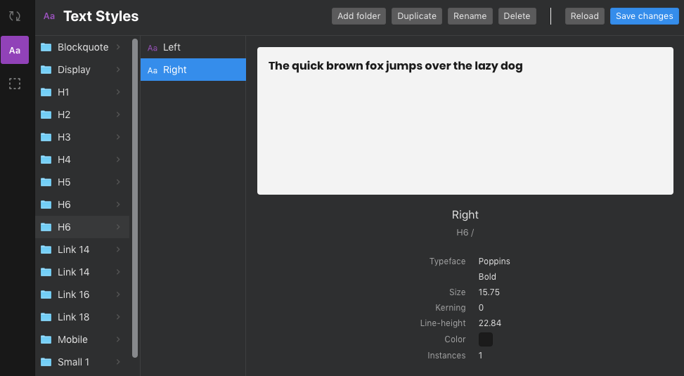
Setting up the font and colour Styles in Sketch
I set up a range of typestyles taken from the guidelines, these included Paragraph, H1, H2, H3, Bullets, etc they have three versions each for example left, right and centre aligned. I created both desktop and mobile font styles taking into account smaller devices. Fonts are based on a baseline scale rule where 14 is the base and all other text styles are an increment of this.
These flexible font styles are versatile and help give us a foundation for the components. If we have major changes in future to colours or fonts then updating the guide styles can also update the entire design system’s styles.
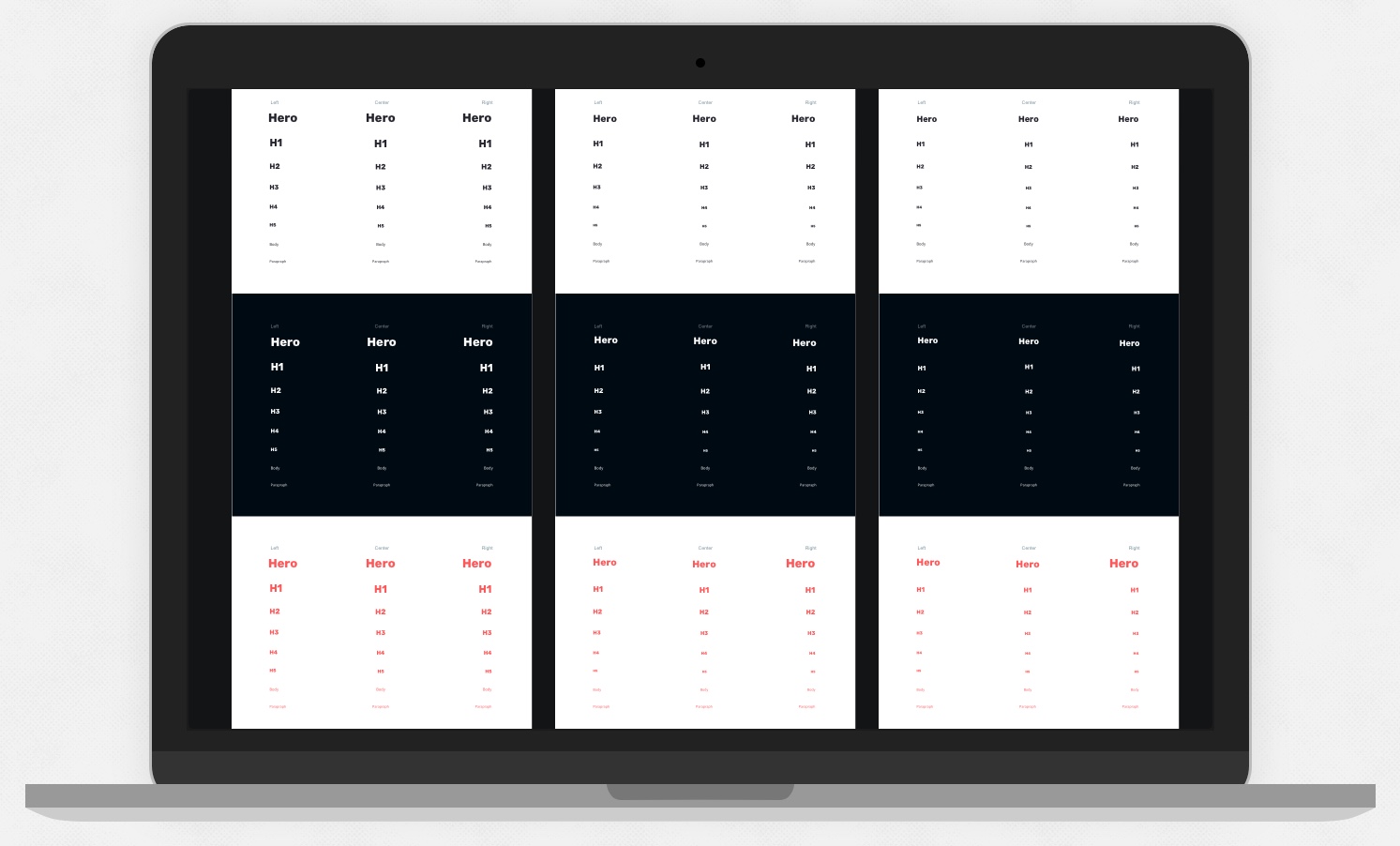
Laying out each font style visually in Sketch to create shared type styles that can be applied to all UI patterns 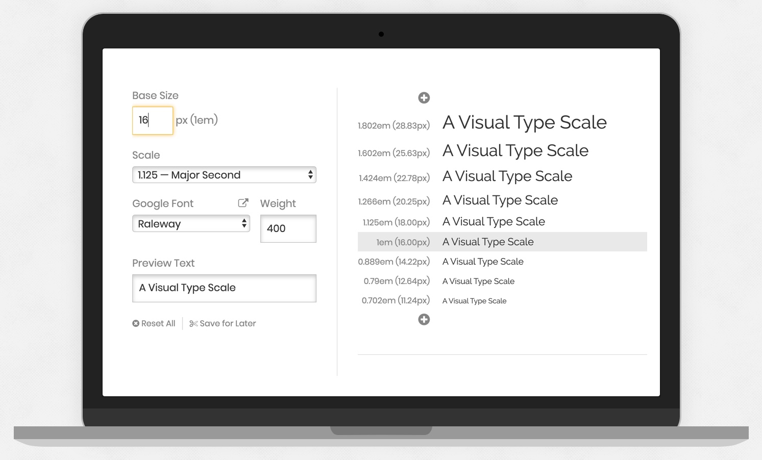
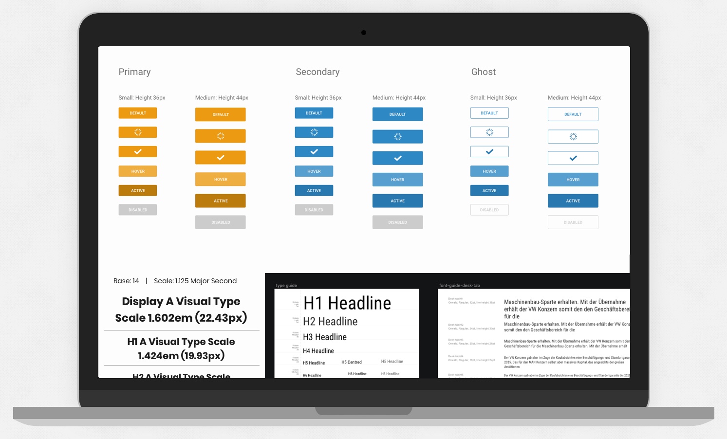
Font Scaling Rules using type scale Calculator Site type-scale.com 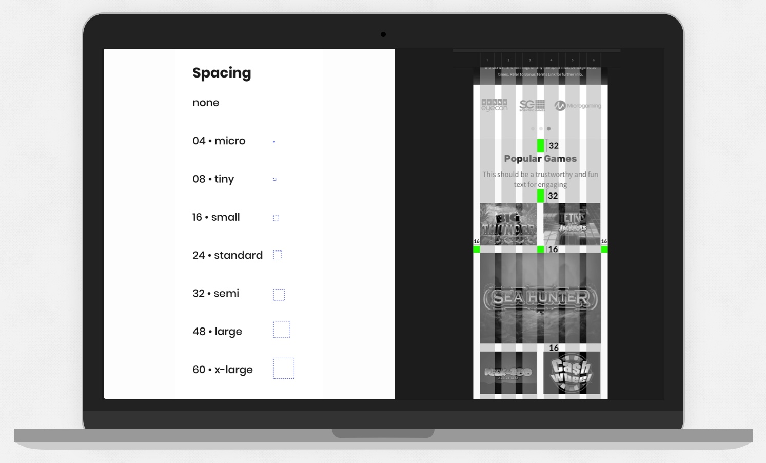
Vertical Rhythm is achieved by following this spacing guide
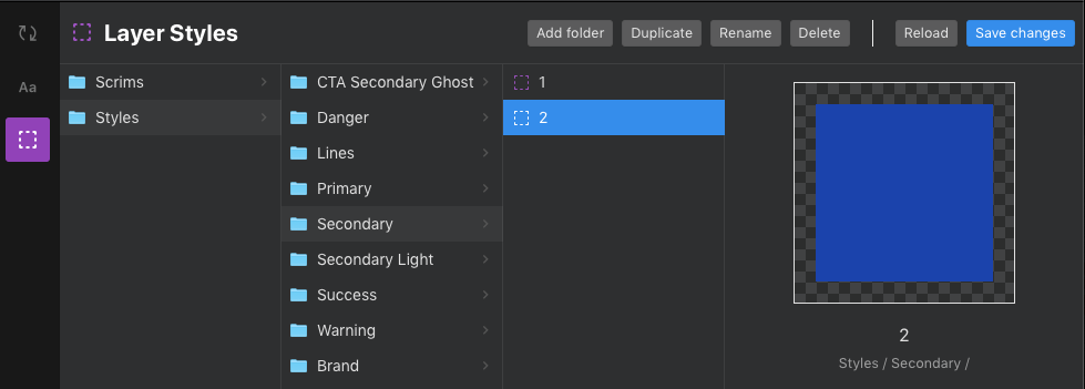
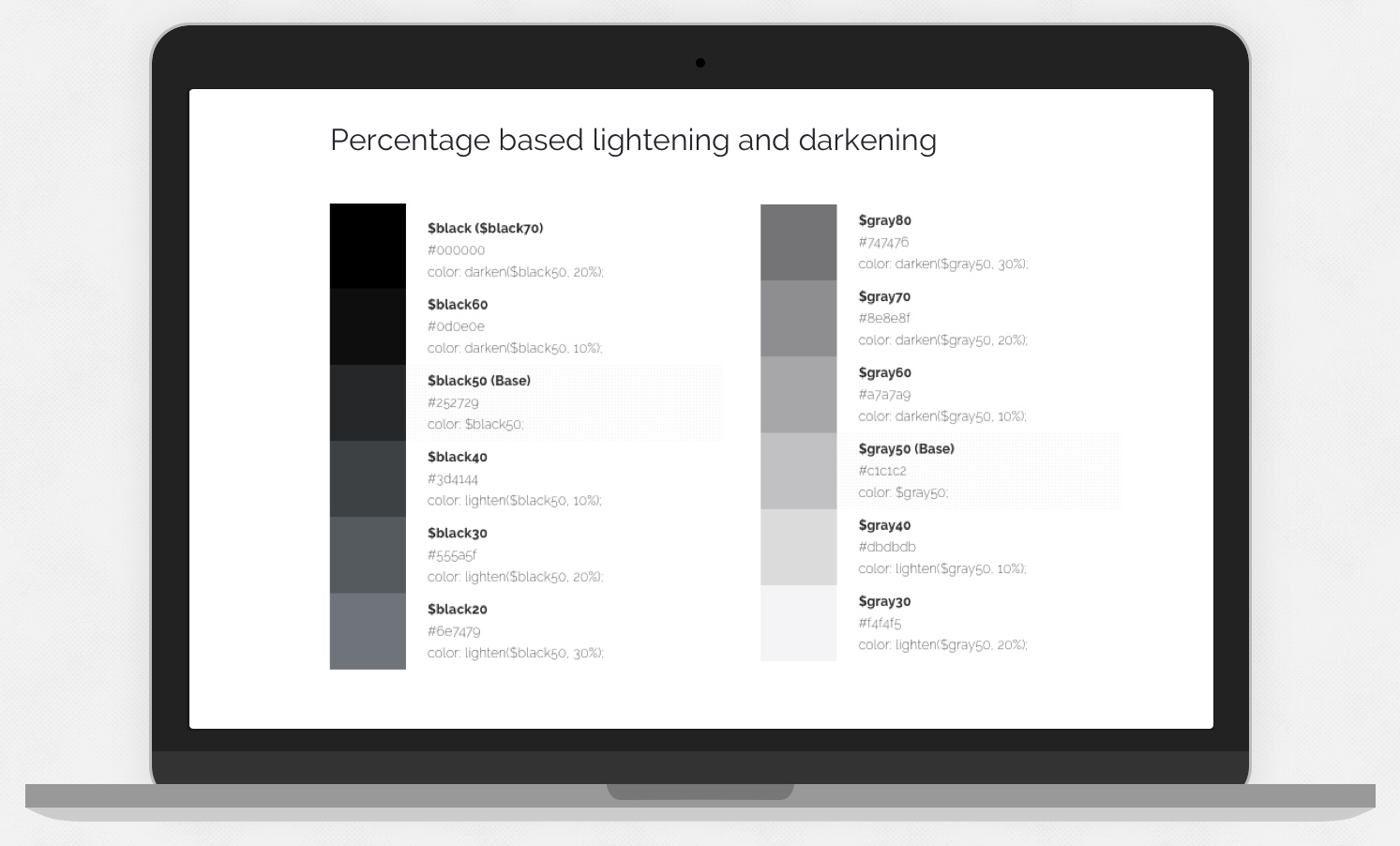
A set of colours were created to represent the brand and also digital patterns, so brand colours are, CTA primary, secondary and ghost, brand colours for background which should include lights and darks for contrast, and system colours which would include success, failure, neutral feedback instances, and I also ensured I created styles to take into account for icons colour sets.
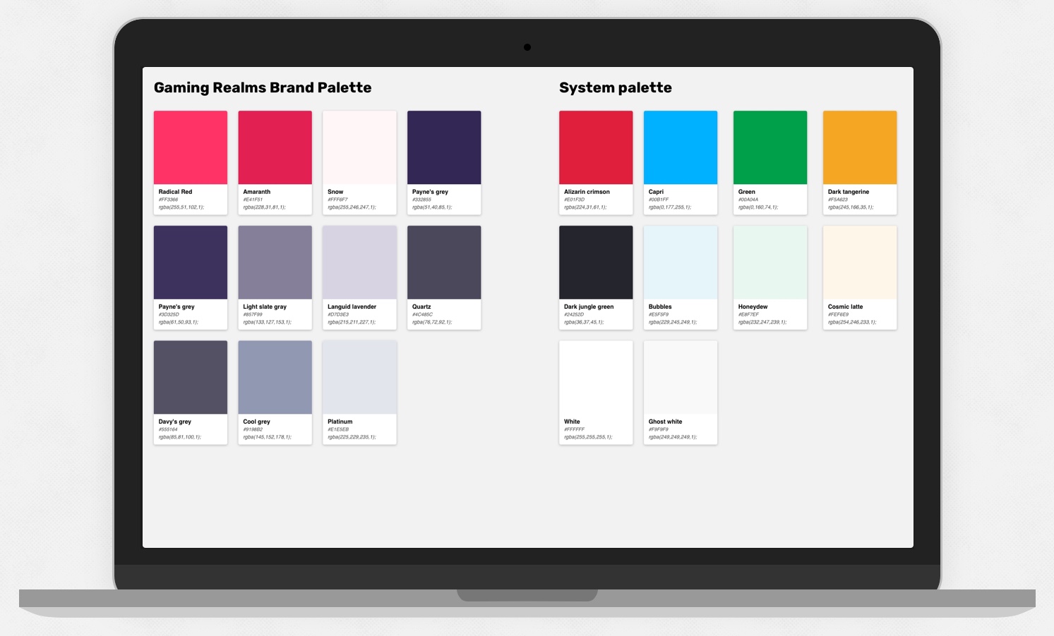
GR Brand Palettes setup in sketch and applied to shared layer styles to be reused 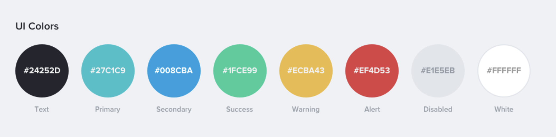
Example of system colours in the Finsys Design System
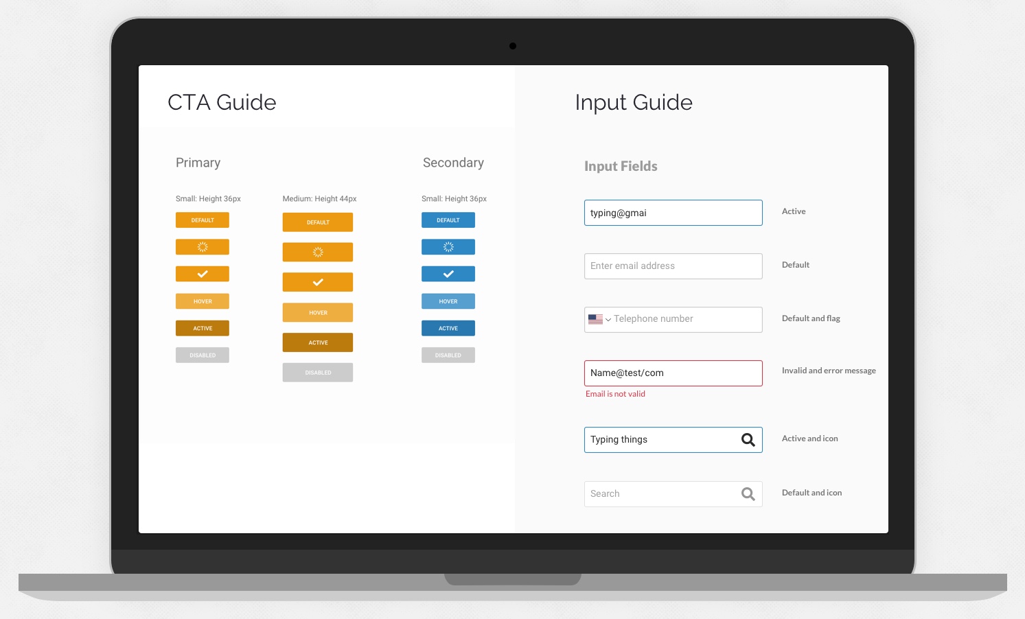
In the guide pages states are represented for things like active, hover, disabled, error and success.
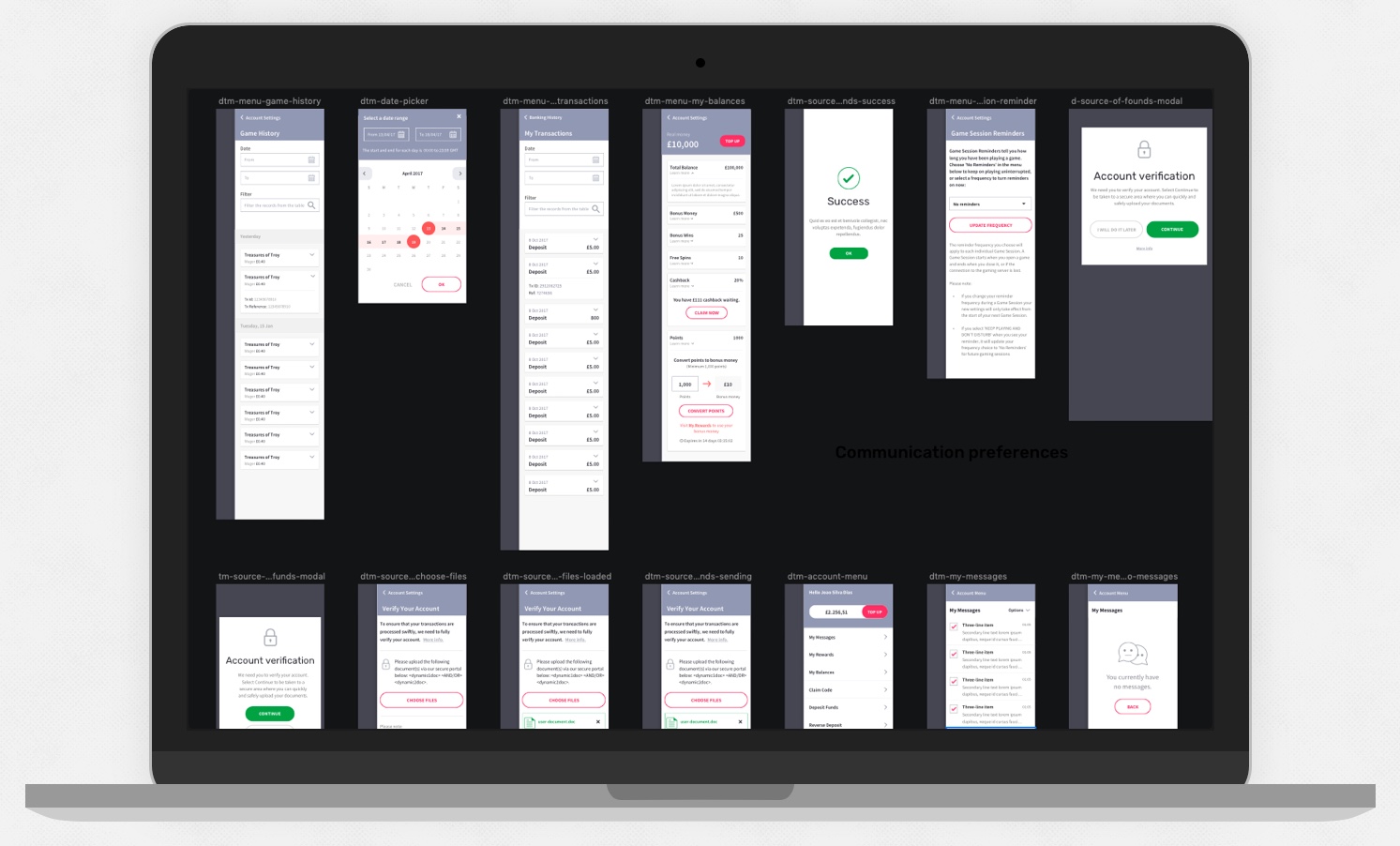
Creating Modules, Components and Templates
I created a suite of components and patterns accounting for all states and scenarios, it was essential for developers to have a documented set of states for each of the elements.
The starting point for me was to create the smallest elements such as buttons, fields and states, icons, toggles, controls, tables and other common elements. By creating the smallest elements first I could ensure a high level of consistency throughout components which combine the smaller elements together.
In Sketch, some components were responsive, some adaptive. I insured a high level of consistency by reuse of components throughout my patterns.
I added the library of existing sketch styles from the guides that I previously created to apply to each component.
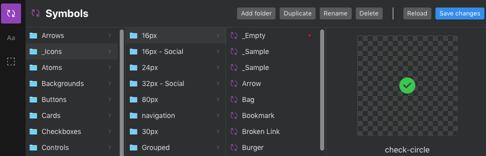
Naming Sketch Symbols
I name the symbols using forward slashes "/" which sorts symbols into folders
- For example, a symbol named “
text-input /” will create a folder called “text-input“, with that symbol as the one symbol in that folder. - Creating a second symbol called “
text-input / error” will add this new symbol into the “text-input” folder.
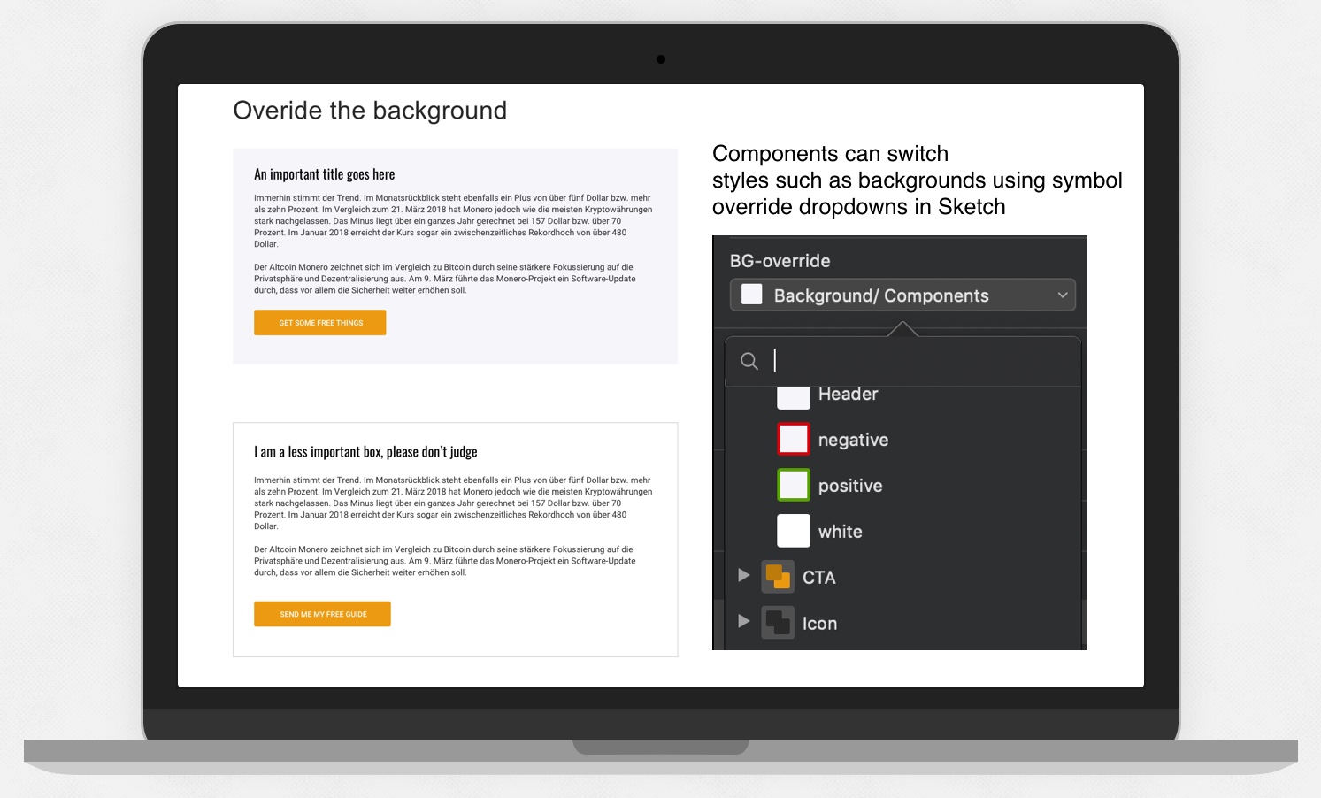
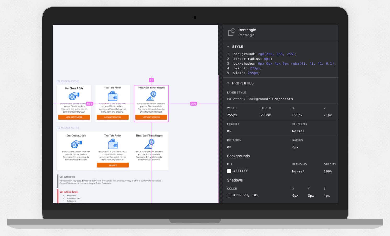
Symbol Overrides
I depend on symbol overrides in Sketch a great deal. Overrides allow one component but with many attributes able to be applied.
An example of a sketch symbol override would be to change the background of a component from one style to another. For example, changing its background from a plain white to a card style with a shadow.
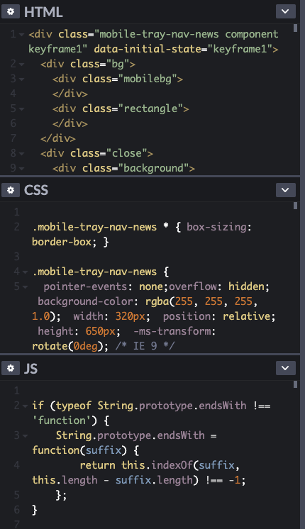
Documenting and Engineering a design system
We started in confluence to create a rough guide with the view of transferring to a storybook for Developers
- Creating stories for devs to for specific components
- Not just how it looks but how components work, the states, where the data comes from
- Sharing previews of the design, specs and CSS/Sass to ease the development process
Naming Conventions
While working on the Finsys design system we decided to name all components so that the developers and I would have a shared reference.
The idea is for the code (CSS) to also use the same naming, so everyone is on the same page.
An example of this would be for SASS colour variables being named with primary, secondary etc
Developer Handover
UI Motion

I used the Anima plugin to create subtle UI motion for templates like navigation panels allowing the export to code for development.
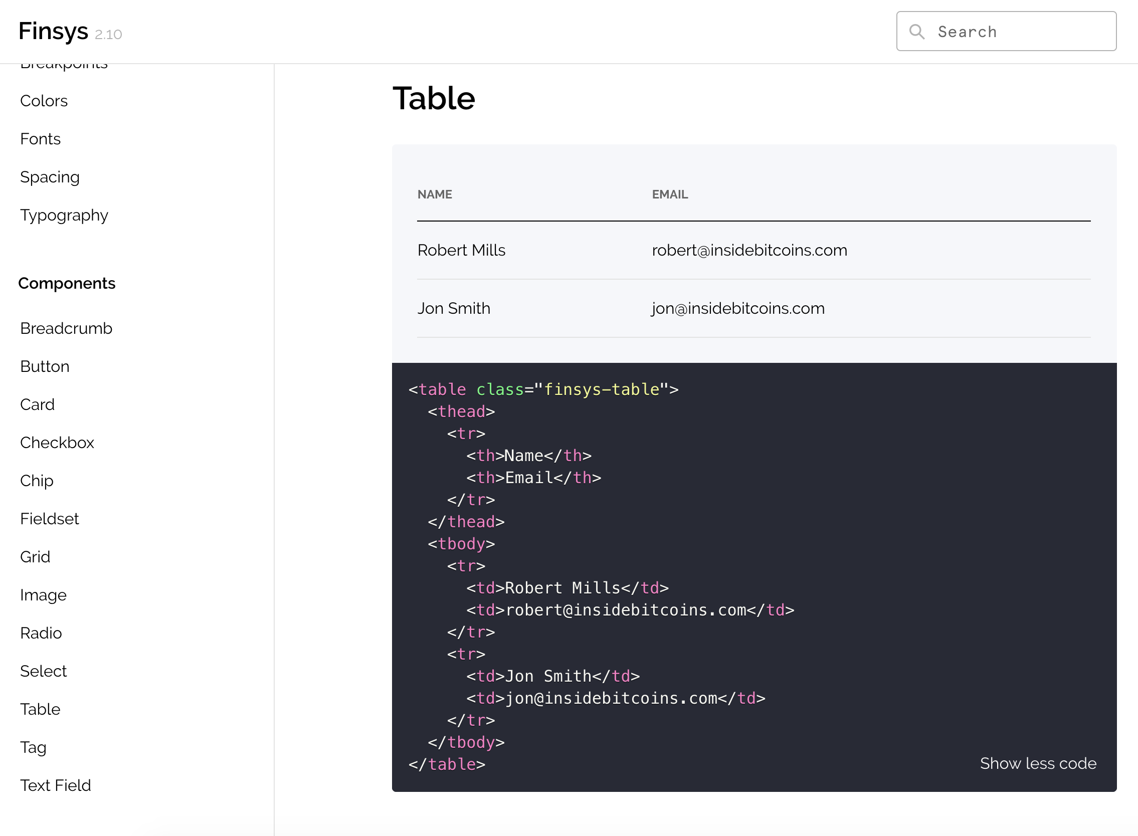
Developer Pattern Library
Below is an example of how components are showcased for developers within a pattern Library. The table component has code and a preview.
Documenting Components in Confluence
The Result
- Design process was more efficient by not redrawing elements over and over on screens and focus can return to journeys, interaction and delight.
- Developers can reuse components resulting in more time coding other aspects of a project.
- Product screens shared a visual language which made for consistent user experience and a higher quality finish.
- QA Testers spent less time finding bugs.
- UX and DEV debt reduced
- Consistent experience for users